Enthusiastic—to work as a team and
respond to high demands and technical challenges.


We challenge ourselves to be more than just a printing shop. Our employees are enthusiastic about their jobs, always trying to find a better way of serving your needs. We pride ourselves on the longevity of our core employees, whose years of experience make them the ideal teachers and problem solvers.

Working together.
Working for you.


Bound printed pieces require special attention to size and placement when building page and cover documents.

Corporate Graphics has supplied interactive worksheets that will help you determine sizes and setup for your pages and cover.
Use the following links to access those that apply. At the top of a worksheet, insert the specifications requested;
the template will display the sizes and setup you should build into your document. 

Click the links below to download the interactive PDF. The worksheets must
be saved to your desktop and opened
in Acrobat Reader for the calculations
to work. 

Cover Worksheet:

Hard Cover Worksheet

Perfect Bound Worksheet

Dust Jacket Worksheet:

Dust Jacket Worksheet

Page Worksheet:

Side-Sewn Page Worksheet

Side Wire Page Worksheet

Smyth, Perfect-Bound,
Saddle-Stitch Page Worksheet

Lay-flat Page Worksheet


Screen_Shot_2017-02-15_at_2.26.35_PM.png

Loading Our Color Settings

Step 1: Loading the Output Style

* For version CS3 and prior: Please submit the native file, all supporting fonts and images. Corporate Graphics will open your file using InDesign CCS and write a PDF. Please request a proof to make sure all fonts, images and text are as intended. 

A. Download output styles and color settings below. 

Click here to download settings for Mac

B. Unzipped downloaded files and move the files into the following locations on your MAC.

GRACoL2013_CRPC6.icc place in the following folder:

Hard drive >> Library >> Application Support >> Adobe >> Color >> Profiles >> Recommended

CGC_ColorSettings.csf place in the following folder: 

Hard drive >> Library >> Application Support >> Adobe >> Color >> Settings >> Recommended


PDF Guidelines

A PDF, or Portable Document Format, file is usually smaller and self-contained. It is a format that includes the document, text, images and vector graphics. If a PDF is written correctly, there is no reason to send the “collected” files, and the potential issues that come with them are eliminated. The following link will assist in this educational process.

Quality PDFs can be sent from the major design programs—QuarkXPress® and InDesign®. Other programs provide opportunities to create PDFs too. Check the program's online help guide to establish if the program has the ability to create high-end PDFs.

Unknown-1.png

How to turn on CGC Color Settings using InDesign

A. Open InDesign CS4, CS5, CS6 or CC. Be sure all documents are closed.

B. Edit >> Color Settings, select CGC_ColorSettings

Click OK.


Writing a PDF

Indesign_CS4-CS6_Instr_mac_2.jpg

A. Open your document.

B. Under File >> Export.

C. Name your pdf.


Indesign_CS4-CS6_Instr_mac_3.jpg

D. Choose Adobe PDF (Print) (not Adobe PDF (Interactive)) >> Save


Indesign_CS4-CS6_Instr_mac_4.jpg

E. Under Adobe PDF Preset: Select CG_pdfx4 >> Export


Color Management

Color Management

Unlike the human eye, hardware and software are not able to see the full range of color. Each system has its range of color or gamut. Your monitor would have a certain range of color, your printer another and your proofer, yet another.

Color management takes these gamuts and integrates software with hardware to create a common color space. The idea is to get the same look from your monitor to your proofing device to our printing press. In order to manage this color space, color profiles need to be integrated into the workflow. Without this, you would need to rely on trial and error. Most often the result of this is a discrepancy between what you see and what you want.


Understanding Profiles

What is a Profile?

Why all colors don’t look the same. Unlike the human eye, hardware and software are not able to see the full range of color. Each system has its range of color or gamut. So, your monitor would have a certain range of color, your printer another and your proofer, yet another. How do we get them to work together? Color management takes these gamuts and integrates software with hardware to create a common color space. The idea is to get the same look as a piece moves from your monitor to your proofing device to our printing press. In order to manage this color space, color profiles need to be integrated into the work flow. Without this, you would need to rely on trial and error, often causing a discrepancy between what you see and what you want.

Types of Profiles

Monitor [display] profile. A monitor profile is created during the calibration process with a device known as a colorimeter. This compares the values and colors it reads to a known set of values and colors. This profile serves as a viewing filter, allowing you to see your image data more accurately. If what you see on your monitor is not representative of the actual colors in your document, you will need to rely on numbers from your image—this has been proven to be tricky but manageable, if done correctly.

Input [source] device profile. Describes the colors on your input device such as a digital camera or a scanner.

Output device profile. Describes the color space of an output device, such as a printer or a press. A color management system uses output profiles to map the colors in a document to the colors within the output device’s color space. Document profile. Defines the specific RGB or CMYK color space of a document. By tagging a profile to a document, you are allowing the application to apply the color profile. This becomes risky as your images in the document may change when a profile becomes attached.

How Do Profiles Work? 

How do profiles work? A profile is the “language of color.” It describes a color space—whether it is a scanner, a monitor or a printer workspace, it defines how a specific device should reproduce color. The color space or profile keeps track of how colors are produced for a particular device’s RGB or CMYK numbers. The profile maps these colors, as a subset that becomes an independent translator for all other devices. A CMYK platform has a smaller gamut of color than an RGB platform, therefore the out-of-gamut vibrance is usually lost when the conversion takes place. The profiles with smaller gamuts of color need to accommodate for the “out-of-gamut” color combinations. This is done by selecting the desired rendering intent at the conversion stage.

When a Profile is Missing or Mismatched.

When opening your image in Photoshop, a warning message may appear. It is important not to let Photoshop automatically convert your image to the working space. Not knowing the color space it came from will make your automatic conversion risky. By selecting either Leave as is (don’t color manage) or Use the embedded profile (instead of the working space), you will have control of the color and how it is converted into the output profile. If the attached profile is the same as your working space, then your image will automatically open with no warning message.


Converting an image into a CMYK Workflow

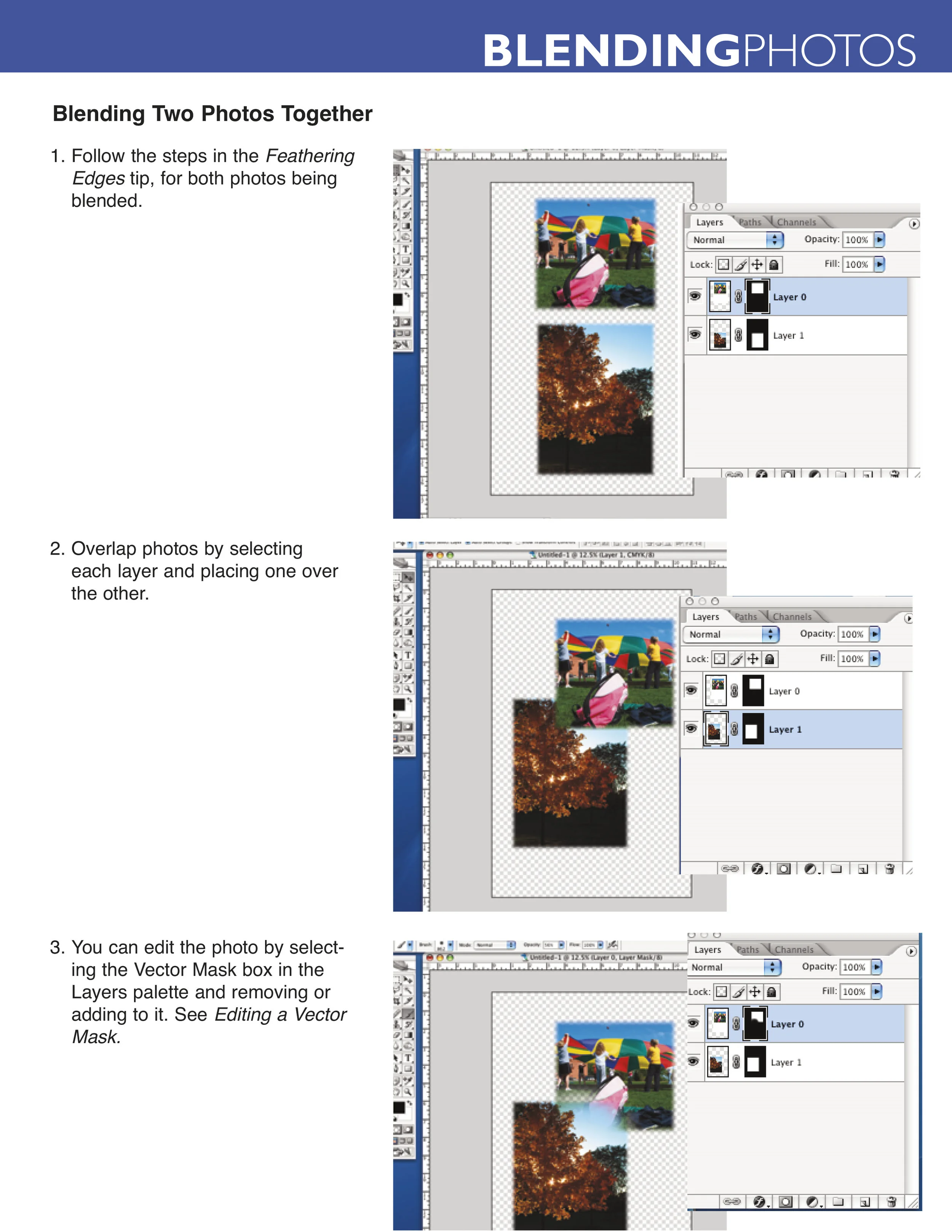
Converting an image in a CMYK Workflow

In this workflow every image is converted from RGB directly into the output device profile prior to submission to the printer. When this conversion takes place the image will be transformed in the CMYK world, once this step is done, you will not be able to convert back to RGB mode and achieve the vibrance again. However, you have control of the final outcome of the conversion. You will know how the image converts into the device color space allowing for additional color correction. 

You will first need to download our PDF Color Settings for Photoshop. Click here for directions on how to set up your settings. 

1. Opening an RGB image and converting to GRACol_2006. In most cases an input profile will be attached to your image and should be Assigned as well. This automatically tells Photoshop how to interpret the image colors.

If the input profile is unknown, Assigning a profile may have many variables. It is best to choose the profile that behaves the best for your needs. CG commonly will use the Adobe RGB (1998) profile. The Adobe RGB (1998) profile has been widely adopted as an RGB working space because it provides a relatively large and balanced color gamut that can be easily re-purposed for reproduction on a variety of devices.

After Assigning your profile you will notice the image has visually changed; however, the number values remain the same. This allows you to visually see what will happen to your image when Converted. If you feel comfortable with any color shift that occurs, you are ready to Convert to the destination output profile of GRACol_2006 profile.

It is important to do these Conversion steps prior to any Photoshop manipulation. Unexpected results occur when adjustment layers are Converted to a different working space.

Knowing the difference between Assigning and Converting.

These two options can cause confusion, as well as some real color disasters if not used carefully. Simply put—Assigning a profile is telling Photoshop where an image has come from; Converting is telling Photoshop where an image is going.

Conversion Options

Engine. Specifies the Color Management Module (CMM) used to map the gamut of one color space to the gamut of another. Most users find the default Adobe (ACE) engine fulfills all conversion needs.

Use Black Point Compensation. Ensures that the shadow detail in the image is preserved by simulating the full dynamic range of the output device. Select this option if you plan to use black point compensation when printing (which is recommended in most situations.)

Use Dither. Controls whether to dither colors when converting 8-bit-per-channel images between color spaces. When the Use Dither option is selected, Photoshop mixes in the destination color space to simulate a missing color that existed in the source space. Although dithering helps to reduce the blocky or banded appearance of an image, it may also result in larger file sizes when the images are compressed for Web use.

Conversion Optons

Engine. Specifies the Color Management Module (CMM) used to map the gamut of one color space to the gamut of another. Most users find the default Adobe (ACE) engine fulfills all conversion needs.

Use Black Point Compensation. Ensures that the shadow detail in the image is preserved by simulating the full dynamic range of the output device. Select this option if you plan to use black point compensation when printing (which is recommended in most situations.)

Use Dither. Controls whether to dither colors when converting 8-bit-per-channel images between color spaces. When the Use Dither option is selected, Photoshop mixes in the destination color space to simulate a missing color that existed in the source space. Although dithering helps to reduce the blocky or banded appearance of an image, it may also result in larger file sizes when the images are compressed for Web use.

Intent Options

Perceptual. Aims to preserve the visual relationship between colors so it is perceived as natural to the human eye, even though the color values have changed. This is suitable for photographic images with lots of color out-of gamut. This type of image sacrifices accuracy to produce a more visually pleasing image, and is also the standard Rendering Intent for the Japanese printing industry.

Saturation. This intent creates the most vibrant color by pushing the color of the image out into the destination space as far as possible. It is not generally used by photographers but is often used for graphics and charts where bold color are desired and accuracy is not as critical.

Relative Colorimetric. This intent compares the extreme highlights of the source color space to that of the destination color space and shifts all colors accordingly. Out-of-gamut colors are shifted to the closest color in the destination space. It works best when the source and destination profiles have similar gamuts, as it preserves more of the original colors in the image. This is the standard Rendering Intent for North America and Europe.

Absolute Colorimetric. Similar to the Relative Colorimetric, colors that fall inside the destination gamut are left unchanged and those that are out-of-gamut are clipped. In this Intent all the colors are based on the white point. In some cases, this can create an undesirable color cast: the white point of the color space needs to align with that of the light source used. If one were printing to a color space for paper with a bluish tint, absolute colorimetric would ignore this tint change, whereas Relative Colorimetric would compensate colors to account for the fact that the whitest and lightest point has a tint of blue.


Color

Corporate Graphics is committed to helping you achieve your desired colors. The following will educate you in properly preparing your files and images for success at the press. If you require further assistance and/or literature, please contact us.

Colors

Fewer than 60% of the Pantone colors can be matched to a CMYK process color. If you need help determining if you should print as a Pantone color or a process color, consult your sales representative.

Color Mode

Corporate Graphics is operating within the GRACol color space. Files that go through our shop will have the GRACol color space applied to them at some point. If you wish to utilize this color management process, please contact us and we will supply you with the GRACol_2006 profile. By doing this, you will have control of what the final CMYK readings of your file will be. However, if you choose to let our system handle it, you may continue to send as normal. Our system will take your tagged and untagged CMYK files and convert them to the GRACol color space. RGB images will be assigned to the Adobe RGB (1998) color space, then converted into the GRACol. This is the recommended way of translating an RGB image into a CMYK, GRACol image. Index and LAB color are not recommended.

Consistent Color Naming

If you are using Pantone (PMS) colors in either a vector based program or Photoshop, be sure to name them exactly the same as they would appear in your layout program. If the names are different, they will appear as two separate colors. We suggest outputting separations of your file to ensure the color separations are done correctly.

Grayscale Artwork

If grayscale artwork cannot be created in a vector-based program, make sure it is created only in a grayscale mode or appears only on the black plate. Frequently we see grayscale images that are processing into a 4-color gray.

Rich Black

A large black solid will look deeper in color when a rich color combination is used. CG suggests the color combination of 40% Cyan, 30% Magenta, 0% Yellow and 100% Black (Rich Black). It is not recommended to use a Rich Black for small text, as it will be harder to register. Instead, use 100% black.

Ink Coverage

Color with greater than 240% total ink coverage is not recommended. It becomes muddy and saturated with ink, which may require more dry time. A relatively close color, usually with less ink, can be achieved by clicking on the “Color Library” in Illustrator or Photoshop—this will convert to a Pantone color. Then select “Picker” to convert back to the CMYK value.

File Submission

Synapse™ InSite®: 

This option is a portal that lets you work directly with CG over the Internet. InSite is based on a PDF workflow and the recommended file type is PDF. InSite helps to manage the PDF file delivery, proofing, corrections and approval process so it is more efficient. Corporate Graphics has supplied a link to educate yourself with this process. If this option interests you, please contact your sales representative for further details

FTP site

This has become the preferred method for many of our customers. To upload to a remote site you will need three elements: the IP/Server address, a user name and a password. These can be obtained through your sales representative before placing your order. Follow this link ftp.corpgraph.com to upload your files. Please compress your files to protect them from corruption.

E-mail

If your file is small enough (under 2 MB), you can zip it and send it via e-mail. Most PDFs, however, cannot be sent this way due to size limitations. Files frequently become corrupt as they travel through the e-mail, and can be forwarded on to multiple people. Be sure to use a compression program to avoid corruption.

CD or DVD

You can place your files on CD or DVD and mail or deliver them to Corporate Graphics. Although this is a slower method of delivery, it gives you an opportunity to send all files to us, including a "collected" version—beneficial if we find errors in your PDF. There would be no need to go back to you to fix the file; we can fix it for you in the collected version.


Spot Colors

Spot Colors

Blending Photos

Blending Photos

Gradients

Gradients

Trapping DCS2 Files

Trapping DCS2 Files

Spot Colors

Spot Colors

Illustrator Transparency

Illustrator Transparency

PDF to Grayscale

PDF to Grayscale

 
Feathering Edges

Feathering Edges

 
BC Imprinting

BC Imprinting